
TheKunadiun wrote…
he just wants to make sure his mom gets credit for taking the original picture is all. (hes my cousin.)
The HTTP part was a high fangled idea that me and kings came up with to kind of create confusion amongst general people lol.
we dont have to use it if you dont want to. its like a "concept" because no one knows about BandAMP and its been missing and its completely user run and so we thought HTTP 404 Page Not Found could work...if you think about it lol. we dont have to use it though.
The AMP Volume 1 works, but we don't nessecarily have to think of this album as a compolation album. The songs that have been selected kind of tie intogether, but each track was made by a different person, all from the community of bandamp. it could really very well be a concept album, or at least not regarded as a compolation album.
also we (the bandamp community) could try to do an album from different artists on the amp like once every year or 6 months or something.
my point is, is that does this need to really be looked at as a compolation album? an album that has a bunch of random songs from different people from this site? i think it could very well be more
with that in mind that could help us find a name
Yes, you're right about the concept album. This doesn't have to be regarded as a 'compilation' album per say, and I think it being an actual 'album' with a concept behind makes it all the much cooler. I'll have to think about it more. Good idea.
kings wrote…
WOW! You guys have been busy!
OK from the top.....b+w circles and purple The Amp......cool but a bit plain. Blue clouds ... very plain.....Sweating metal and sprayed text......very cool indeed.
But I like The Ks creation more and more.....with clouds.
I agree the 'The Amp' in the corner could be the site logo its self. And what about 'layering' a picture of an actual page (or make your own) with HTTP etc on it, I just find the system font text a little plain and if it was part of an actual page heading it would convey the right 'idea' more directly.
As I said I like it more and more....I'm now seeing the 'rebelliousness' and the 'independence' in it, and the duality in it. The concept that it is says so much......The guys them selves are the 'HTTP files not found' as the go into the night OR the idea of them going against the 'internet' and modern technology, as all they get is HTTP File Not Found / Access denied kind of reaction from it all so they turn away and head back into the waist-lands.
As you can see I really like the cover and it's idea
**Yes your right it's HTTP not HTML ..... ma bad!
")
So, we're going to use TK's pic right? Cool. Now the only 'roadblock' seems to be the actual name. I like 'TheAMP'. Maybe we can incorporate them both like - The AMP Vol. 1: File Not Found? I really do not like the 'HTTP' part at all. Maybe just call it Files Not Found, 404 - or my friend had a cool idea called about:blank.
Edit: I was looking through photos on google, and it sort of reminded me how annoying those error messages are lol. But, I do like the idea of having an Internet/Music themed album.

I dont like this version anywhere near as much as the other one...whats with the flower things?
now it looks all happy and in the day and stuff.
@kings: Yes thats a perfect description of the cover/album and the whole idea. excellent!!!
fais, try going back to the original photo with just the clouds layered in and without those water type drippy things that are on this one and try and make the title seem as real as possible. my input: dont like this version of the picture.
as for the name, i want to hear what kings has to say. we could combine both names like you suggested fais.
TheKunadiun wrote…
I dont like this version anywhere near as much as the other one...whats with the flower things?
now it looks all happy and in the day and stuff.
@kings: Yes thats a perfect description of the cover/album and the whole idea. excellent!!!
fais, try going back to the original photo with just the clouds layered in and without those water type drippy things that are on this one and try and make the title seem as real as possible. my input: dont like this version of the picture.
as for the name, i want to hear what kings has to say. we could combine both names like you suggested fais.
Looking at it, I don't like the rain effect as much, but as far as it looking 'happy'..I don't really see the problem with that. There's different types of sounds on the album, not just dark songs, so I don't see what would be wrong with that. I think I'll just use the original picture with the clouds. When you think about it, we dont have to have any words on it..just the photo. It's been done before - and it'll be pretty cool. Let the photo speak for itself. As for the name..I think I'm just going to call it TheAMP. I'm not feeling the whole concept of the files not being found, it all seems a bit overly complicated for this sort of thing.
Okay perfect fais. Use the original with the clouds you put on it, and have no words. that would be so EPIC!!!!
call it TheAMP Volume 1 or whatever you want just keep the words of the cover. thats so perfect.
just to be sure im talking about the same one your talking about

theres some kind of texture on this one as well, and its not as bad as the rain one so we can keep it but see how it looks with and without the texture (id describe it as sort of a fingerprint type look...it looks good i just want to see the difference between them)
alright man this rocks
call it TheAMP Volume 1 or whatever you want just keep the words of the cover. thats so perfect.
just to be sure im talking about the same one your talking about
theres some kind of texture on this one as well, and its not as bad as the rain one so we can keep it but see how it looks with and without the texture (id describe it as sort of a fingerprint type look...it looks good i just want to see the difference between them)
alright man this rocks
I'm hoping this is the final version. The only thing I changed was the overall 'browness' of the picture, and added a bit more color. I have a feeling that everyone going to hate it, but I like it. I was listening to the album when I made it, so I think it fits. Not too dark and depressing, and not too happy. I think its good. So I hope its good.
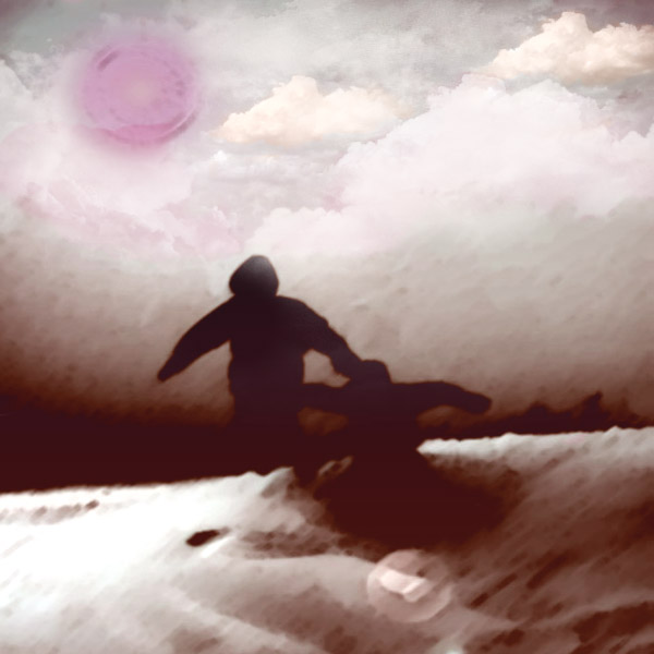
i honestly like the brown one better LOL. i guess i like the brown better cause thats how i made it....
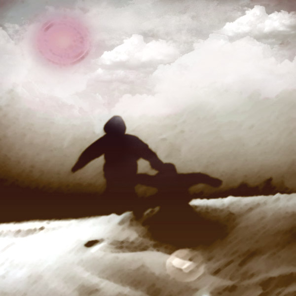
well lets try and get a vote, which do you like better people?
The "brighter/purpler" version or the "browner/darker" version?
I vote for browner, and I think fais votes for the purpler.
(Remember the one that is brown will have no words on it)
well lets try and get a vote, which do you like better people?
The "brighter/purpler" version or the "browner/darker" version?
I vote for browner, and I think fais votes for the purpler.
(Remember the one that is brown will have no words on it)
TheKunadiun wrote…
i honestly like the brown one better LOL. i guess i like the brown better cause thats how i made it....
well lets try and get a vote, which do you like better people?
The "brighter/purpler" version or the "browner/darker" version?
I vote for browner, and I think fais votes for the purpler.
(Remember the one that is brown will have no words on it)
Its more burgundy than purple lol You also have to think what would be more appealing to the 'general public'. For example, people who like pop, or rock, or any of the other genres that's on the album.
exactl,y what would the general public like. i think both are good it just depends on what most people like.
if you just wanna use the brown one thats cool and I think when people see it they will be like woah how cool and mysterious. i think the same reaction could be developed from the "burgendy" one, it just depends on personal taste etc.
go with whatever feels right to you.
when your submmitting this make sure you list the credit correctly for each song and for the cover design etc. (im sure you know this already i just like restating things)
sigh 
lol thats fine i think itll work great. (still i wanted a vote lol...)
it acutally looks a lot better than the first burgendy picture i just noticed so way to go! it actually looks very good.
EDIT:
Please ignore everything I said above, this actually looks very good, I noticed that you merged the brown with the burgendy so everyone wins. way to go!!
You guys out or not?
The pictures done some millage...! The purple one look like a bad trip!
I still like the picture in post #111 and #127, it has more depth and colour, if only the clouds were not over the guys in the middle......any way....Kunadiun you want my opinion on a name...I like the HTTP File Not Found idea, and I still do, it can still be anything anyone comes up with as long as people agree I suppose.
bandAmp the 404 files
what ever....... The Amp vol 1 ... inspirational ! Do it! As I said before it says what needs to be said...clearly, and there's going to be a vol 2 some time.
Sorry, you do not have access to post...
Wanna post? Join Today!