
| need help on cover artwork |
Since a couple of days I try to explore and learn more about working with foto programs . I´m using a simple, not too complex program as "PAINT.Net" ( better than PAINT) and want to design a new artwork for my album cover.
I´d like to ask you which cover concept you prefer. Which design do you like most?
Here´s a selection of 5 pics.
Thnx
U . L . I .
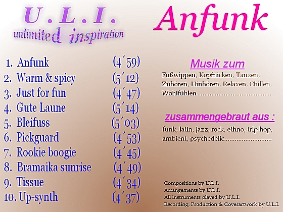
These are the tracks :
1. Anfunk
2. Warm and spicy
3. Just for fun
4. Gute Laune
5. Bleifuss
6. Pickguard
7. Rookie boogie
8. Bramaica sunrise
9. Tissue
10.Up-Synth
.....and thisone will be the cover of the next album .........bit spacey....
I´d like to ask you which cover concept you prefer. Which design do you like most?
Here´s a selection of 5 pics.
Thnx
U . L . I .
These are the tracks :
1. Anfunk
2. Warm and spicy
3. Just for fun
4. Gute Laune
5. Bleifuss
6. Pickguard
7. Rookie boogie
8. Bramaica sunrise
9. Tissue
10.Up-Synth
.....and thisone will be the cover of the next album .........bit spacey....
I think #4 (second row, second column) is the most attractive, and uses the best color scheme. I see what you were doing with #5, but my eyes see a guitar sitting upright on a couch covered in a cloth, instead of actual angle you used with it on the floor!
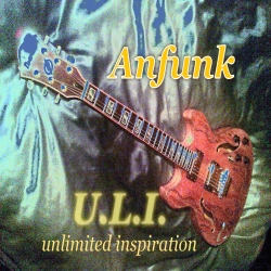
#3 and #4 are my favorites. possibly i'd learn more towards #3 because "unlimited inspiration" is in black.
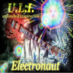
I like #5 , though once TLS mentioned it I also saw it's on a sofa and turned on it's side ....
But the design I like, the colours are the nicest and the text is cool ..
The first 4 just look like wobbly morphed guitars
I'm not too sure what happened to the last one ... every thing kind of fell on the canvas ...")
I'd like #5 even better if Anfunk was a bit more right and ULI unlimited etc was more to the left.
But the design I like, the colours are the nicest and the text is cool ..
The first 4 just look like wobbly morphed guitars
I'm not too sure what happened to the last one ... every thing kind of fell on the canvas ...
I'd like #5 even better if Anfunk was a bit more right and ULI unlimited etc was more to the left.
I wouldn't choose #5 because its too similar looking to what you want to do for your next album cover.
Thank ya´ll for your impressions and advises, guys
As everything in art it´s always a matter of taste, mood & the current situation. Everyone´s arguments and suggestions are right. But the choice keeps still hard.
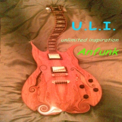
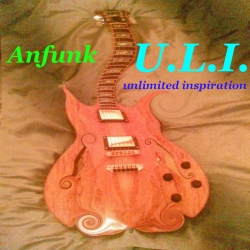
The first four pics are just 1 foto I worked with. I shot the git lying on my bed from the " body view ".
Personaly I´ve extracted two solutions :
1 : # 3 and 4 are quite similar . Differing only in tiny contrast changes and the text . I like these concepts because it´s artifical , screwed and has a wobbled character , as ´kings `mentioned . It´s a bit analogical to my music.")
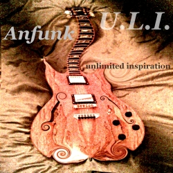
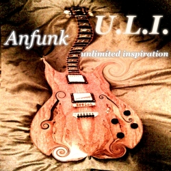
2 : # 5 and 6 are also only 1 foto ( 180° rotated ) , this time the git was lying again on my bed but I shot from the " headstock view".
I have an idea of continuity , a " red thread " , something recognizeable . That´s why I think about choosing # 5
because it so similar to # 6.
But there´s no rush for me so I can think furthermore about the right decision.
Today I´ve been sitting the whole day long ( 14 hrs) on my ´lappi` and played with my fotoprogram . Everyday I´m improving a lil bit .
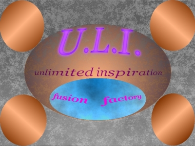
Let me introduce you my VERY FIRST LOGO I created just with the tools in the program .
This time I didn´t work on a foto.
I´d like to use it as my new avatar . What do you think ???
As everything in art it´s always a matter of taste, mood & the current situation. Everyone´s arguments and suggestions are right. But the choice keeps still hard.
The first four pics are just 1 foto I worked with. I shot the git lying on my bed from the " body view ".
Personaly I´ve extracted two solutions :
1 : # 3 and 4 are quite similar . Differing only in tiny contrast changes and the text . I like these concepts because it´s artifical , screwed and has a wobbled character , as ´kings `mentioned . It´s a bit analogical to my music.
2 : # 5 and 6 are also only 1 foto ( 180° rotated ) , this time the git was lying again on my bed but I shot from the " headstock view".
I have an idea of continuity , a " red thread " , something recognizeable . That´s why I think about choosing # 5
because it so similar to # 6.
But there´s no rush for me so I can think furthermore about the right decision.
Today I´ve been sitting the whole day long ( 14 hrs) on my ´lappi` and played with my fotoprogram . Everyday I´m improving a lil bit .
Let me introduce you my VERY FIRST LOGO I created just with the tools in the program .
This time I didn´t work on a foto.
I´d like to use it as my new avatar . What do you think ???
No dont !
About #5 though... if you blank out / hide (with your fingers) the bottom corners, hiding the edge of the bed, you lose the optical illusion that the guitar is on its side. And your left with an amazing fiery/watery/metallic effect behind the guitar in the quilt cover.
The creation above reminds me of the wall paper I had as a teenager ... a whole wall covered in those kind of spots and spheres ... wow trip out or what !
You could use the lasso tool and 'lift' the guitar.
If your working in layers you can go back to #6 when you know some more and work at it again.
It's a bit busy and full at the moment , needs some space and depth.
OK looking at 1,2,3 and 4 again, I like the 'twirled' body ... a lot ... but I dont like the twisted neck.
That's what makes it look 'just morphed', makes me think of hippy music... with flowers in their hair and a bit wobbly with it too.
But morphing the body into some amazing fantasy I can see.
At this size the neck looks like a roll of movie film.
That's what makes it look 'just morphed', makes me think of hippy music... with flowers in their hair and a bit wobbly with it too.
But morphing the body into some amazing fantasy I can see.
At this size the neck looks like a roll of movie film.
kings wrote…
If your working in layers you can go back to #6 when you know some more and work at it again.
It's a bit busy and full at the moment , needs some space and depth. ;)
I didn´t work in layers there . Its only one layer . First time I tried this layer stuff 3 days ago.
Kings wrote :
"At this size the neck looks like a roll of movie film."
This was intented . I like this ´crazy `neck .
You see that my music´s weird, my pics are weird and I suppose my mind is also weird .

In real life it´s not always beneficial , but as an artist I guess it makes me a "brand". I hope so at least. hihihi
Tnx a lot for ya support , dude. I appreciate it very much.

| re: re: need help on cover artwork |
brightone wrote…
second row - left one! good word dude
U . L . I .
Well, it took a time to decide but with help of you guys , another forum and my friends at home I reached a decision which is mostly congruent to your opinions and my own intentions.
The winner is........................................# 5 .....surprise........surprise
And I´ll change my avatar . #4 (w/o text)
Let me thank ya´ll for ya participation and honest feedback. Helped a lot.
U . L . I .
The winner is........................................# 5 .....surprise........surprise
And I´ll change my avatar . #4 (w/o text)
Let me thank ya´ll for ya participation and honest feedback. Helped a lot.
U . L . I .
| new creations |
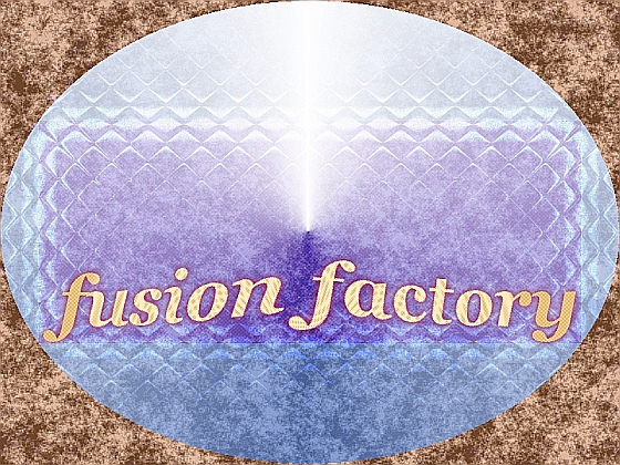
The last days I continued my experiments with "GIMP" and "Paint.net" to understand better how to work on layers , using tools and all that stuff.
I tried out to create grafics without a foto as a draft.
Composed some new logos and a CD-Inlet which I like to show you guys.
Here they are..................................
U . L . I
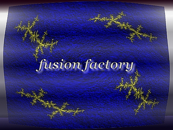
CD-Inlet.......
I tried out to create grafics without a foto as a draft.
Composed some new logos and a CD-Inlet which I like to show you guys.
Here they are..................................
U . L . I
CD-Inlet.......
Sorry, you do not have access to post...
Wanna post? Join Today!