| Picture Four |
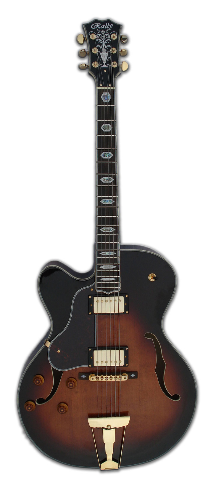
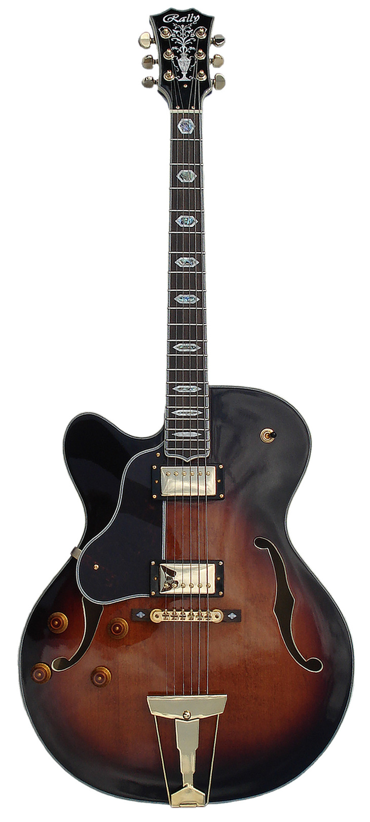
Ok, I'm learning something every time, I enlarged it as much as I could, used 1px to fine erase, I'm not sure about if I'm doing the feathering correct, but this is what I got this time. Oh and this photo was taken OUTSIDE would you believe, there must have been less light, but I think it's OK, what do you think?


Layers dear boy......layers........like an onion....!
And don't erase....select!
You could also get a good picture of the guitar against a beautiful silky material (whatever material) keeping enough space to the right of the guitar so the material becomes the background to the page.
Using photoshop you could also fade from the material into a colour.
So trying to separate the guitar from the bg dont matter no more!
| re: Rally |
kings wrote…
Yes I've spent a few hours on this, no I'm not totally happy with it, yes I think it's good enough to show you what I mean and yes I've saved more than one selection and effect on different layers in Photoshop.....so it can always be altered
Oh Wow Kings you are my Hero, I want to learn how to do that. I only had time to edit the new photo I took today.
I've recorded another version of "BandAMP Swing" with this here guitar, just got to master it up and clean it up, a bit like you did here with this photograph. I sure do intend to learn how to produce photographs like this.
One critique, which I'm sure you have noticed is the bottom left edge is not smooth as the rest, but hey it's miles better than what I have done up till yet. I'm very grateful for you taking time in your busy schedule to produce this piece of ART.
| re: re: Rally |
Denis wrote…
kings wrote…
Yes I've spent a few hours on this, no I'm not totally happy with it, yes I think it's good enough to show you what I mean and yes I've saved more than one selection and effect on different layers in Photoshop.....so it can always be altered
Oh Wow Kings you are my Hero, I want to learn how to do that. I only had time to edit the new photo I took today.
I've recorded another version of "BandAMP Swing" with this here guitar, just got to master it up and clean it up, a bit like you did here with this photograph. I sure do intend to learn how to produce photographs like this.
One critique, which I'm sure you have noticed is the bottom left edge is not smooth as the rest, but hey it's miles better than what I have done up till yet. I'm very grateful for you taking time in your busy schedule to produce this piece of ART.

Yes the bottom right hand edge, that's the bit I'm not overly happy with, their single pixels that only showed up once I put a shadow on the layer, and I only saw it once I'd saved it and had already gone back once to get rid of a few more.
This is where having a smooth bg helps a lot when trying to cut an image out. I think the neck and head came out fairly well on this one but the line around the whole body is quite dodgy!
I'll send you the psd file you can check it out your self.

Very funny Denis, I bought a 22" high resolution monitor today ......... EVERYTHING looks amazing. 
I think it looks very nice, much better without the depth, head on, just the shape.....though I do like the effect (look and feel) of the first picture, if you compare the two this one is has a metallic lightness about it especially on the head and neck. But the body for this last one is crisper and there's not too much light reflecting off the metal fitting.
But this one is very cool indeed , I really like the body it has a beautiful effect / look. The neck and head have come out with a lot of 'contrast'.
kings wrote…
Very funny Denis, I bought a 22" high resolution monitor today ......... EVERYTHING looks amazing.
I think it looks very nice, much better without the depth, head on, just the shape.....though I do like the effect (look and feel) of the first picture, if you compare the two this one is has a metallic lightness about it especially on the head and neck. But the body for this last one is crisper and there's not too much light reflecting off the metal fitting.
But this one is very cool indeed , I really like the body it has a beautiful effect / look. The neck and head have come out with a lot of 'contrast'.
Superb, I wish I had a high res' job.
Yeah the first picture has brought out the colours in the body better, I think it was sheer luck on the day in terms of outside light conditions and the angle of the camera. The effect on last picture is the refelction off the clouds, it has a softer feel too it, if you notice I purposely had the camera angle so that it did not pick out the sides of the guitar in order to make it easier to cut out.
I used the mask feature in photoshop and was able to smooth out the border.
This is the one I'm going to use for the web, next I need to design the front page.
Thank for all your help with this Kings, your a STAR..

Sorry, you do not have access to post...
Wanna post? Join Today!


